Renai
From Local Website to International Brand
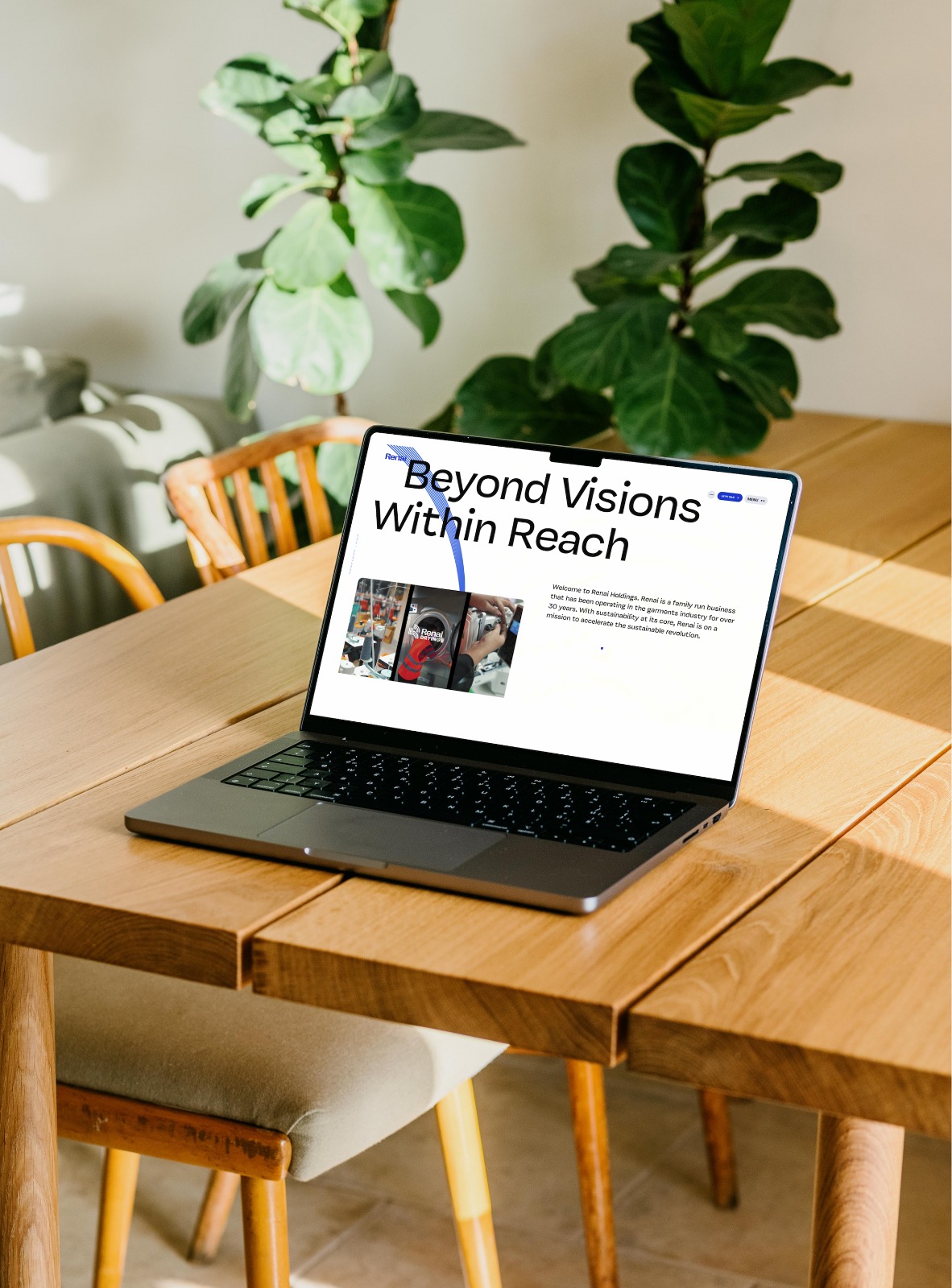
Renai had a website. It worked. It loaded. It showed products. But it was run-of-the-mill-indistinguishable from a thousand other small business sites, with generic templates, flat photography, and no point of view. It didn't look like a brand. It looked like a brochure. Renai's team knew they were capable of more, but they were too close to their own story to see the gap between where they stood and where they could compete. They needed to punch above their weight-to present themselves not as a local player, but as an international brand with a clear identity and a reason to exist. The real challenge: Renai didn't just need a redesign. They needed a vision shift-from "a company with a website" to "a brand with a story."
Research & Insights
We started by deconstructing what makes a brand feel international versus local.
Competitive Benchmarking
We analyzed 20+ brands in Renai's category across Europe, North America, and Asia-studying how they used whitespace, typography, motion, and narrative to signal premium positioning. The pattern was clear: international brands don't shout. They curate. They don't list features. They build worlds.
Brand Audit
Renai's existing site had no hierarchy, no tension, no point of view. We identified that Renai's sustainability practices-already present but buried-could become a differentiator if treated as part of a larger brand philosophy rather than a checkbox.
Stakeholder Discovery
Through workshops, we pushed Renai's team to articulate what they wanted to be known for in five years. That exercise revealed the ambition: they didn't want to be a regional supplier. They wanted to be an international brand that happens to care deeply about sustainability.
Concepts Explored
We presented three strategic directions:
Concept
The Pitch
Why We Rejected It
The Local Artisan
Warm, traditional, craft-focused aesthetic. Celebrates heritage and regional roots.
Reinforced the "local small business" perception. Wouldn't scale into international markets.
The Corporate Green
Clean, clinical, sustainability-report aesthetic. Heavy on certifications and data.
Felt like a compliance deck, not a lifestyle brand. No emotional pull.
The International Storyteller (Selected)
Bold, editorial, world-class design language. Treats every page as a brand film. Sustainability woven into the narrative as a natural philosophy, not a marketing add-on.
Positioned Renai alongside international competitors. The storytelling framework actually gave Renai a lens to evaluate their own product lines-"Does this fit the brand we're becoming?"
Final Execution
We didn't build a dashboard. We built an exam engine.
Design Language
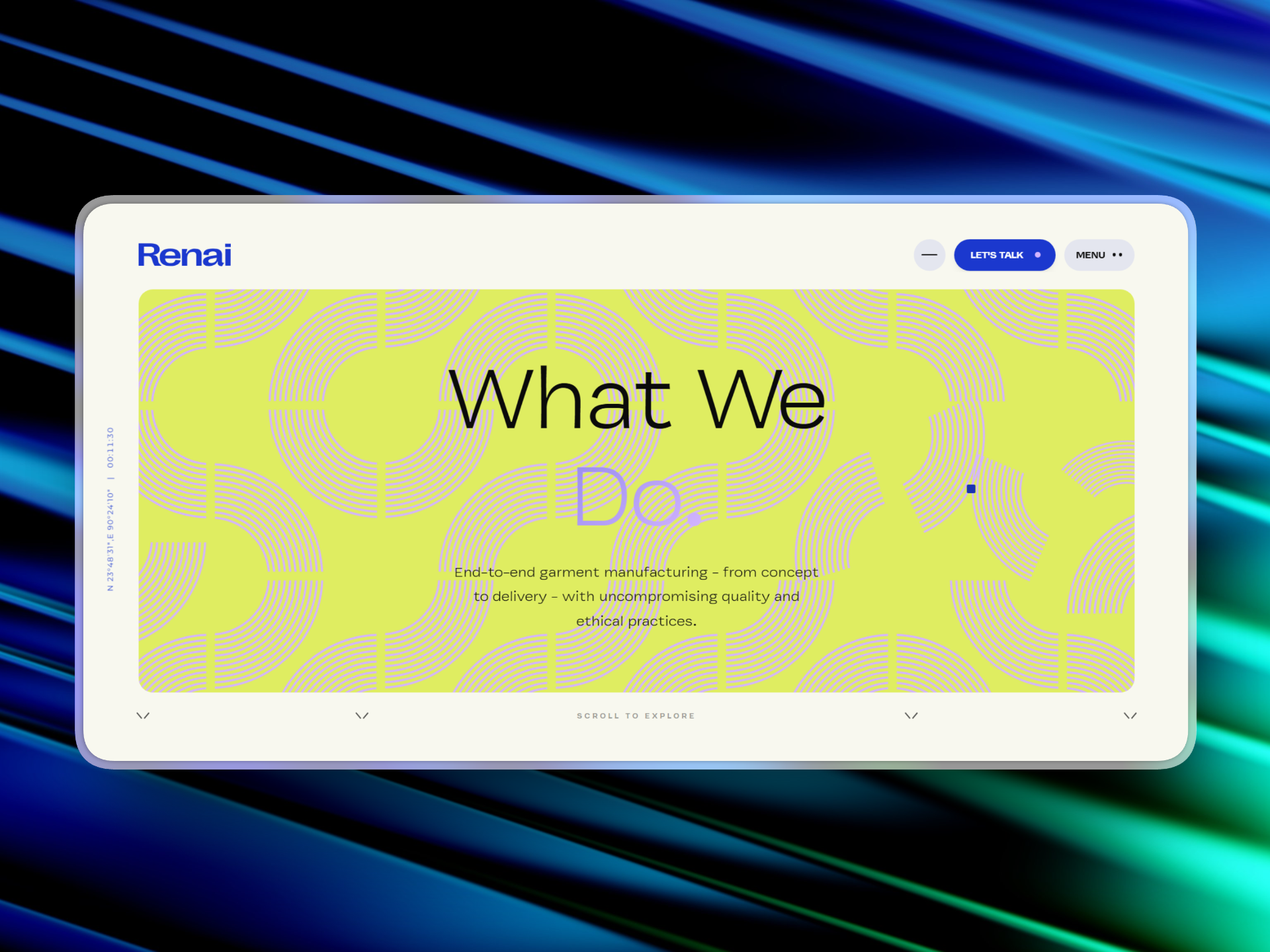
Editorial-grade typography, cinematic product photography, and a restrained palette that lets the products breathe. Every page feels intentional-like a magazine spread, not a catalog. Motion is purposeful: subtle reveals, smooth transitions, and scroll-driven storytelling that keeps the user immersed.
Brand Architecture
The site is structured around story, not inventory. Visitors enter through a brand narrative-who Renai is, why they exist, what they believe-before ever seeing a product grid. Product pages carry that same DNA: each item is presented with context, craft, and care, reinforcing the idea that Renai sells choices, not just goods.
Sustainability as Story, Not Sticker
Rather than slapping "eco-friendly" badges everywhere, sustainability is embedded into the brand narrative. It's part of the origin story, the material choices, and the long-term vision. It feels earned, not performative.
The Vision Shift
Critically, the website became a mirror for Renai's own evolution. The storytelling we built forced Renai to ask: "If we're presenting ourselves as an international brand, do our product lines match that ambition?" That question drove them to refine, expand, and evolve their offerings to align with the brand they were now showing the world.
Renai About Page
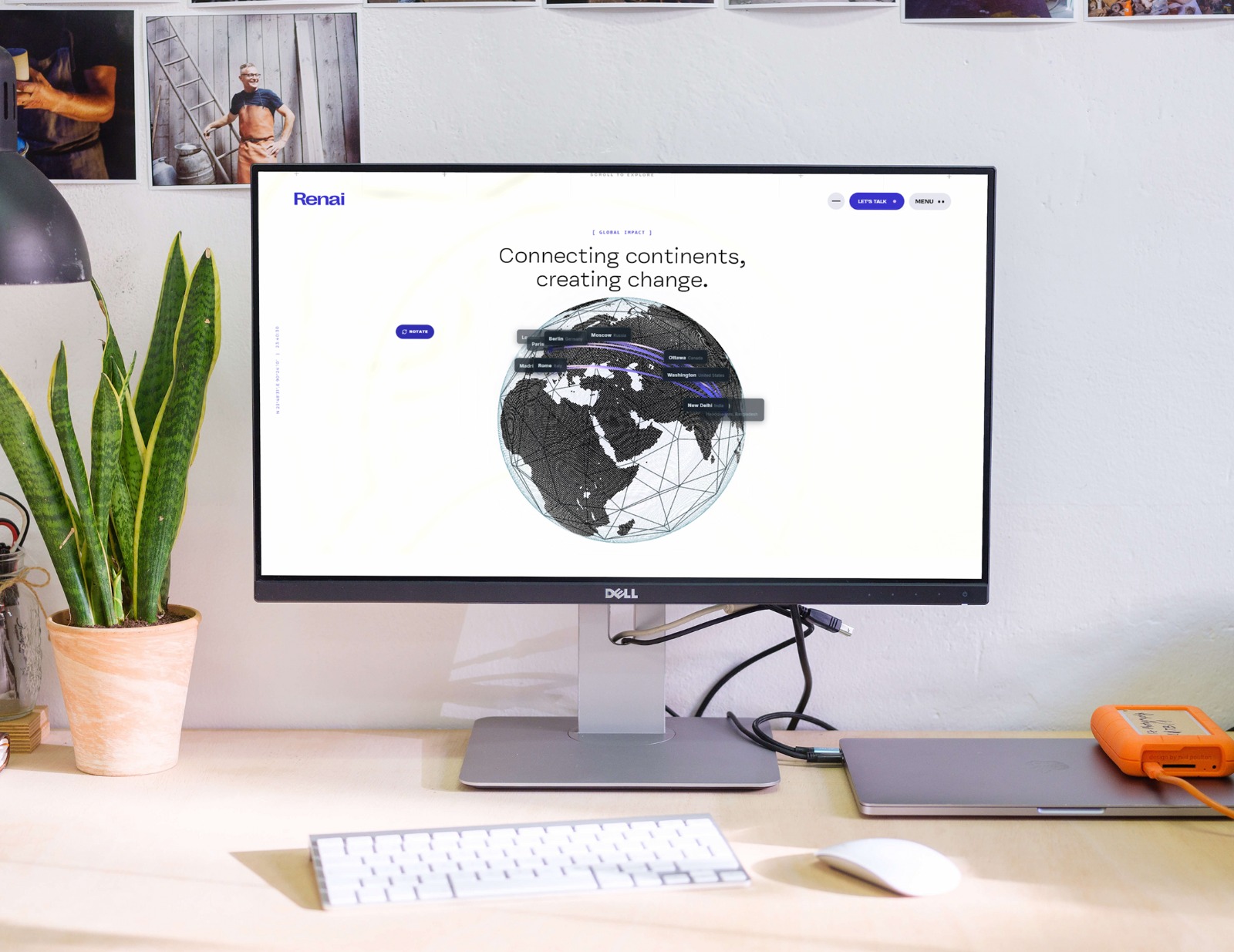
Renai Website
Validation
Within 2 months of launch:
New customer acquisition-Renai began landing customers and partnerships that previously wouldn't have taken them seriously. The website became their best salesperson.
Brand perception shift-feedback consistently described Renai as "a brand I could see in international markets, " not a local player trying to look bigger
Internal clarity-the storytelling framework we established directly influenced Renai's product roadmap. They began evolving their lines to match the international brand identity the site projected.
Sustainability as differentiation-by integrating it into the brand story rather than treating it as a feature, Renai carved out a distinct position in a crowded market.
Renai didn't just get a new website. They got a new vision of themselves-and the digital presence to back it up.